Fitness Website Redesign: 2x Bookings, -41% Drop-off
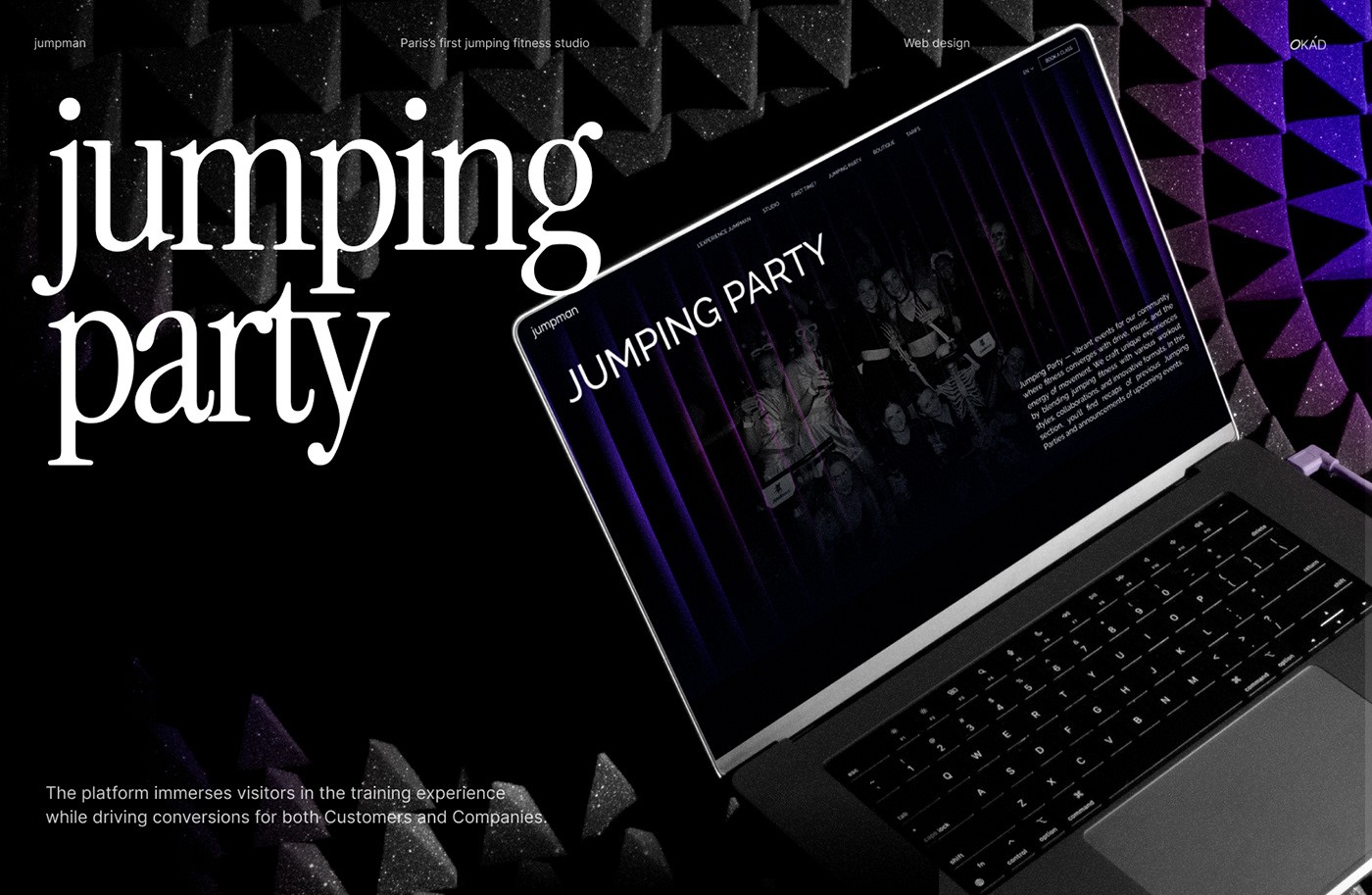
Jumpman is the first trampoline fitness studio in Paris, operating since 2016. With new locations opening and franchise interest growing, the brand needed a website that could convert both everyday fitness clients (B2C) and potential franchise partners (B2B). The previous site was functional but outdated — it lacked visual energy, had a clunky booking flow, and offered no clear path for franchise prospects. We were brought in to rebuild the entire digital experience on Framer, aligning it with the recently completed brand identity overhaul.

Strategic Website Goals
We defined four non-negotiables with the Jumpman team:
- Frictionless booking in 2 clicks — booking a class had to feel as easy as jumping
- High-impact atmosphere — visitors needed to feel the drama, lights, and movement from the homepage
- Guidance for newcomers — a dedicated “First Time?” page addressing unspoken fears
- Franchise-ready infrastructure — strategic copywriting and visual storytelling that speaks to investors
Before touching any design tool, we mapped the full user journey for both audience segments. We identified that first-time visitors typically dropped off at the pricing step, while franchise prospects left because they could not find investment details without contacting the team. Both problems became central to the redesign.
UX & Web Design Features
The end-to-end web experience combined UX strategy, visual storytelling, and conversion optimization:
- Dual-purpose navigation — optimized paths for B2C first-timers and B2B researchers
- Custom UI with theatrical transitions — layered visuals supporting the “Phantom Stage” brand identity
- Responsive animations — movement and energy reflected across all devices
- Integrated session videos — lights, jumps, shadows, and sweat captured in embedded footage
- Modular components — designed for faster, cheaper future franchise site launches
We built each page as a self-contained module in Framer, meaning any future franchise location can launch its own site by swapping out location-specific content — schedule, photos, address — without redesigning anything. This modular architecture cut the estimated cost of each new franchise site by roughly half.

Conversion-Focused Design
Every design choice prioritized performance alongside aesthetics:
- Clear CTAs always within reach on every page
- Minimalistic forms with auto-validation to reduce friction
- Mobile-first booking experience for on-the-go users
- Fast-loading visuals despite complex animations
Over 70% of Jumpman’s audience visits from mobile, so we designed the booking flow mobile-first and then adapted it upward for tablet and desktop. Form fields were reduced to the bare minimum — name, preferred time slot, and contact info — with auto-validation catching errors inline rather than after submission. The result was a booking experience that felt instant.

What Made This Project Unique
Most fitness studio websites treat B2C and B2B as separate projects. Jumpman’s challenge was combining both into a single site without diluting either experience. The theatrical “Phantom Stage” brand concept gave us a unifying visual language strong enough to carry both journeys — the drama and energy attract class-goers, while the polished presentation signals credibility to franchise investors. This dual-purpose approach is something we also explore in our guide on how to design a website that converts.
Results
- Doubled B2C bookings within the first month of launch
- 54% increase in session time — users spent more time exploring videos and testimonials
- 41% reduction in drop-off rate thanks to smoother funnel and visual storytelling
- Franchise materials integrated seamlessly into the site, boosting credibility and streamlining partner onboarding
The modular Framer architecture also set Jumpman up for future growth — each new franchise location can go live in days rather than weeks, with full brand consistency guaranteed from day one.

Frequently Asked Questions
How did the website serve both fitness clients and franchise partners?
Navigation was optimized for two journeys: B2C visitors land on class schedules and 2-click booking, while B2B partners access franchise materials, brand positioning, and investment details — all without cluttering either experience.
What made the booking flow convert so well?
We reduced booking to 2 clicks with auto-validated forms, mobile-first layout, and CTAs always within reach. Combined with immersive video content, session time increased by 54% and drop-off fell by 41%.
How long did the website project take?
The full custom website — including UX strategy, UI design, development, copywriting, and franchise integration — was delivered in 6-10 weeks.
Like this work?
Let's discuss your project — we'll prepare a strategy and estimate within 48 hours.
Book a Call