University Merch Design: Alumni Collection (Case Study)
SUNC MSU (Specialized Educational and Scientific Center of Moscow State University) is a selective school for talented students. The alumni association needed merchandise that would serve as a symbol of membership, a reward for community engagement, and a tool for fostering connection among graduates. Unlike typical university merch, this collection had to carry real emotional weight — it would be given as recognition for alumni who actively contribute to the community, not sold in a campus bookstore.

The Challenge
The project had specific constraints:
- No detailed brief — the client preferred to see design concepts immediately rather than write a spec
- Younger demographic — previous merch targeted alumni aged 45+, but this collection needed to appeal to the 18-35 range
- Dual purpose — the merch had to work as both a symbol of belonging and an earned reward for participation in alumni activities
The generational shift was the central design problem. The existing merch featured a formal, traditional aesthetic that resonated with older graduates but felt disconnected from younger alumni who had grown up with tech culture, digital art, and streetwear-influenced design sensibilities.
Design Approach
Instead of waiting for a traditional brief, we created three concepts to present in a single call, with each designer on the team proposing a distinct direction. This multi-concept approach let the client react to concrete visuals rather than abstract descriptions — a method that consistently produces faster alignment and stronger outcomes, especially when the brief is open-ended.

Three Concepts
All three concepts built on the community’s symbol — the cube — and aligned with alumni values:

- NFT Cube — digital art-inspired, modern and unique, targeting digitally-oriented younger alumni. The cube was rendered as a 3D generative artwork, each item feeling one-of-a-kind.
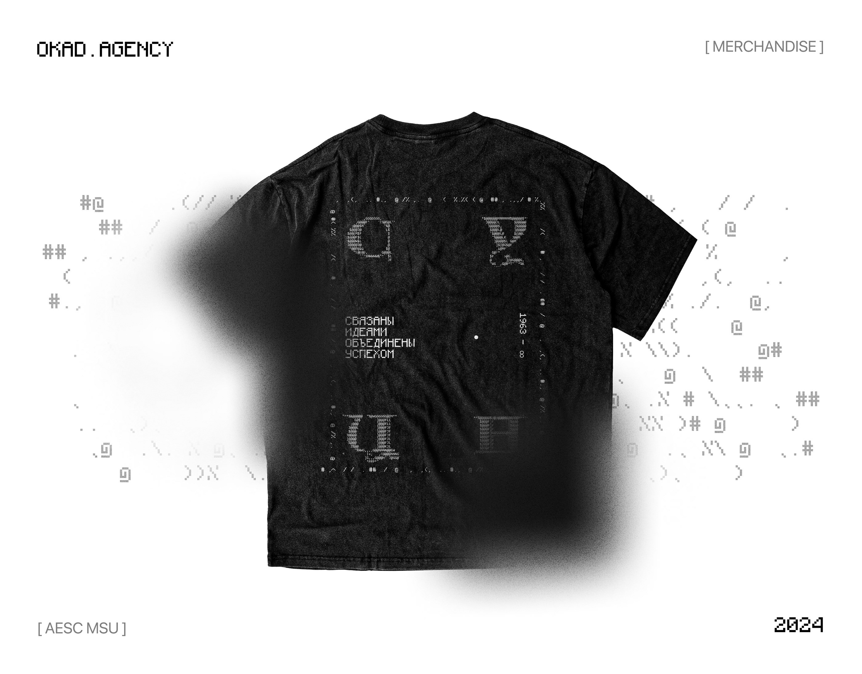
- Programmer’s Style — monospace fonts, code-style layout, vectorized cube mimicking stylized code, aimed at tech-savvy graduates. This concept leaned into the school’s strong STEM reputation.
- Classic University Style — clean lines, minimalism, and traditional university aesthetic. Simple enough for mass production while capturing community identity. The cube was abstracted into a geometric emblem that worked at any size.
The Chosen Direction
The client selected the classic university style for its versatility and production friendliness. We finalized the design by:
- Experimenting with font variations and typography — testing serif, sans-serif, and custom letterings against the cube emblem
- Selecting color options for the t-shirt range — including both neutral tones and bolder accent colors to give alumni choice
- Creating detailed mockups showing the final product in real-world context — on-body photos, flat lays, and product close-ups
The final design balances sophistication with wearability. The cube emblem is prominent enough to be recognized by fellow alumni but subtle enough to wear as everyday clothing — not a novelty item that gets worn once at a reunion.

What Made This Project Unique
Having team members who were actual SUNC alumni gave us an insider perspective that no amount of research could replicate. They understood the unspoken cultural references, the pride that comes with the school’s competitive admissions, and the specific humor and aesthetics that resonate with this community. That authenticity is hard to manufacture, and it shows in the final product. Community-driven design is also central to how we approached the Gently automotive brand ecosystem, where understanding the community’s identity was the foundation of the entire project.
Results

- Positive community reception — alumni feedback confirmed the design resonated with the target 18-35 demographic
- Fast delivery — the multi-concept approach allowed rapid iteration without extended briefing cycles
- Production-ready output — minimalist design was easy to adapt for printing across different merchandise types
- Authentic connection — team members with SUNC alumni ties ensured the design reflected genuine community culture
The merch is now part of the alumni association’s ongoing engagement program, with plans to expand the collection based on the design system we established. For a broader look at how brand identity and creative production work together, see our article on brand identity vs. performance creative.

Frequently Asked Questions
How did you design without a detailed brief from the client?
We presented three distinct concepts early on — NFT-inspired, programmer-style, and classic university — to give the client immediate visual options. This let us capture preferences in a single call and move fast without a traditional brief.
How do you design merch that appeals to a younger alumni audience?
We shifted from the previous 45+ aesthetic by incorporating modern trends (digital art, code-style graphics) alongside clean minimalism. Having team members who were SUNC alumni themselves gave us direct insight into the 18-35 demographic.
What made the classic university concept win over the other directions?
It was the most versatile and production-friendly. Clean lines and minimalism captured the community's identity while being easy to adapt for mass printing across different merch types.
Like this work?
Let's discuss your project — we'll prepare a strategy and estimate within 48 hours.
Book a Call