Website Redesign ROI: Real Numbers From 4 Projects
2x bookings, -41% drop-off, +54% session time — real metrics from 4 website redesigns. When to redesign, what drives ROI, and how long it actually takes.
A website redesign is either the best investment a business makes all year or a six-figure waste of time. The difference comes down to one question: are you redesigning based on what looks outdated, or based on what is measurably broken?
We have redesigned websites for fitness studios, AdTech platforms, real estate portals, and cultural institutions. Each project started with a specific business problem — not “the site looks old” but “bookings dropped 30%” or “support tickets about navigation are overwhelming the team.” And each project produced measurable results within the first month.
Here are four redesigns with real numbers.
Case 1: Jumpman — 2x Bookings With a 2-Click Flow
Jumpman is a fitness studio in Paris offering group classes, personal training, and corporate wellness programs. Their website was functional but underperforming: too many steps to book a class, high drop-off rates on mobile, and no clear separation between individual clients and corporate inquiries.
The Numbers After Redesign
- 2x bookings in the first month after launch
- -41% drop-off rate across the booking funnel
- +54% average session time compared to the previous site
These are first-month numbers, not projections.

What Drove the Results
The 2-click booking flow. The previous site required five steps to book a class: find the schedule, select a date, choose a class, create an account, confirm the booking. We reduced this to two clicks: select a class from the visual schedule, confirm with payment. Account creation happened in the background during checkout rather than as a gate before it.
Reducing booking friction from five steps to two had the single biggest impact on conversion. Every additional step in a booking flow loses 10-20% of users. Going from five steps to two mathematically explains most of the 2x improvement.
Dual B2C and B2B journey design. Individual clients and corporate wellness managers need completely different information. The previous site mixed both audiences on every page. The redesign created distinct pathways from the homepage: individuals see class schedules, pricing, and trainer profiles. Corporate visitors see program packages, team size options, and case studies from other companies.
This separation alone reduced confusion-driven drop-offs. When a corporate wellness manager lands on a page full of individual class schedules, they leave. When they land on a page showing corporate packages with “Teams of 10-50” pricing, they stay.
Mobile-first responsive design. Over 70% of Jumpman’s traffic comes from mobile devices — people searching for fitness classes on their phones during commutes or lunch breaks. The previous site was technically responsive but not designed for mobile-first interaction. Buttons were too small, the schedule was hard to navigate on small screens, and the booking form required excessive scrolling.
Platform: Built on Framer. Timeline: 6-10 weeks from kickoff to launch.
Case 2: Moboost — AdTech Redesign in 30 Days
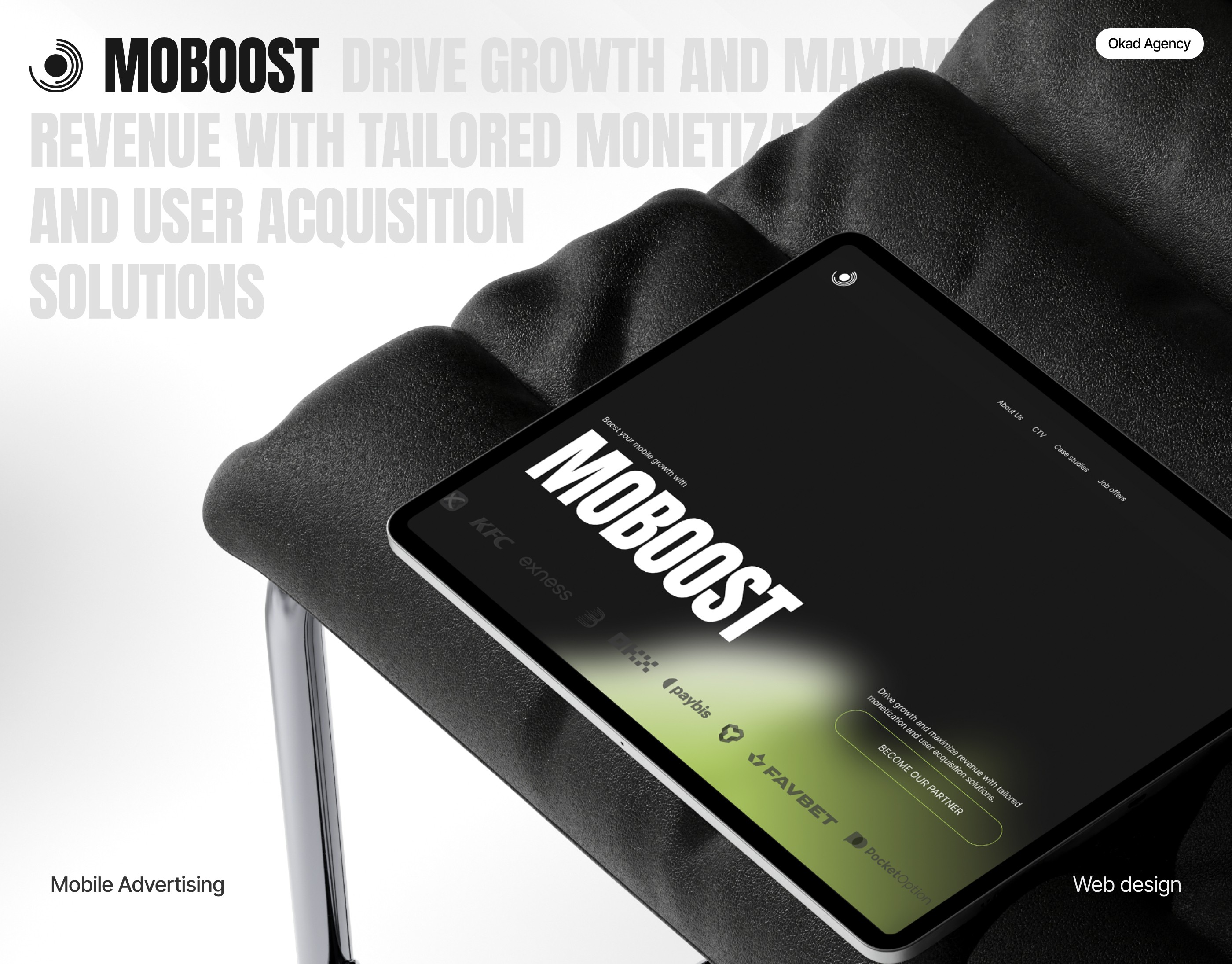
Moboost is an advertising technology platform serving enterprise clients including KFC, Adidas, Binance, and HBO. Their existing website did not reflect the scale of their client base or the sophistication of their product. They needed a complete redesign — and they needed it in 30 days.
The Speed Challenge
Thirty days for a full website redesign is aggressive. Most projects of similar scope take 8-12 weeks. Making this timeline work required three things: a clear design direction locked in during week one, parallel design and development workflows, and a client team that could review and approve within 24 hours.
The design direction was bold gradients with a modular layout system. Every page used the same component library — cards, feature blocks, testimonial sections, pricing tables — arranged in different configurations. This modular approach meant new pages could be assembled from existing components rather than designed from scratch.
China-Ready Optimization
Moboost operates in the Chinese market, which introduces specific technical requirements that most Western design agencies overlook. Pages need to load without dependencies on services blocked in China (Google Fonts, certain CDNs, embedded YouTube videos). Font stacks need to include Chinese character sets. Layout must accommodate text that does not word-wrap the same way English does.
We built these requirements into the design system from day one rather than retrofitting them after launch. This avoided the common problem of a site that looks perfect in the US and breaks in Beijing.
Platform: Framer. Timeline: 30 days.
Case 3: Ocenka — UX Redesign in 2 Weeks
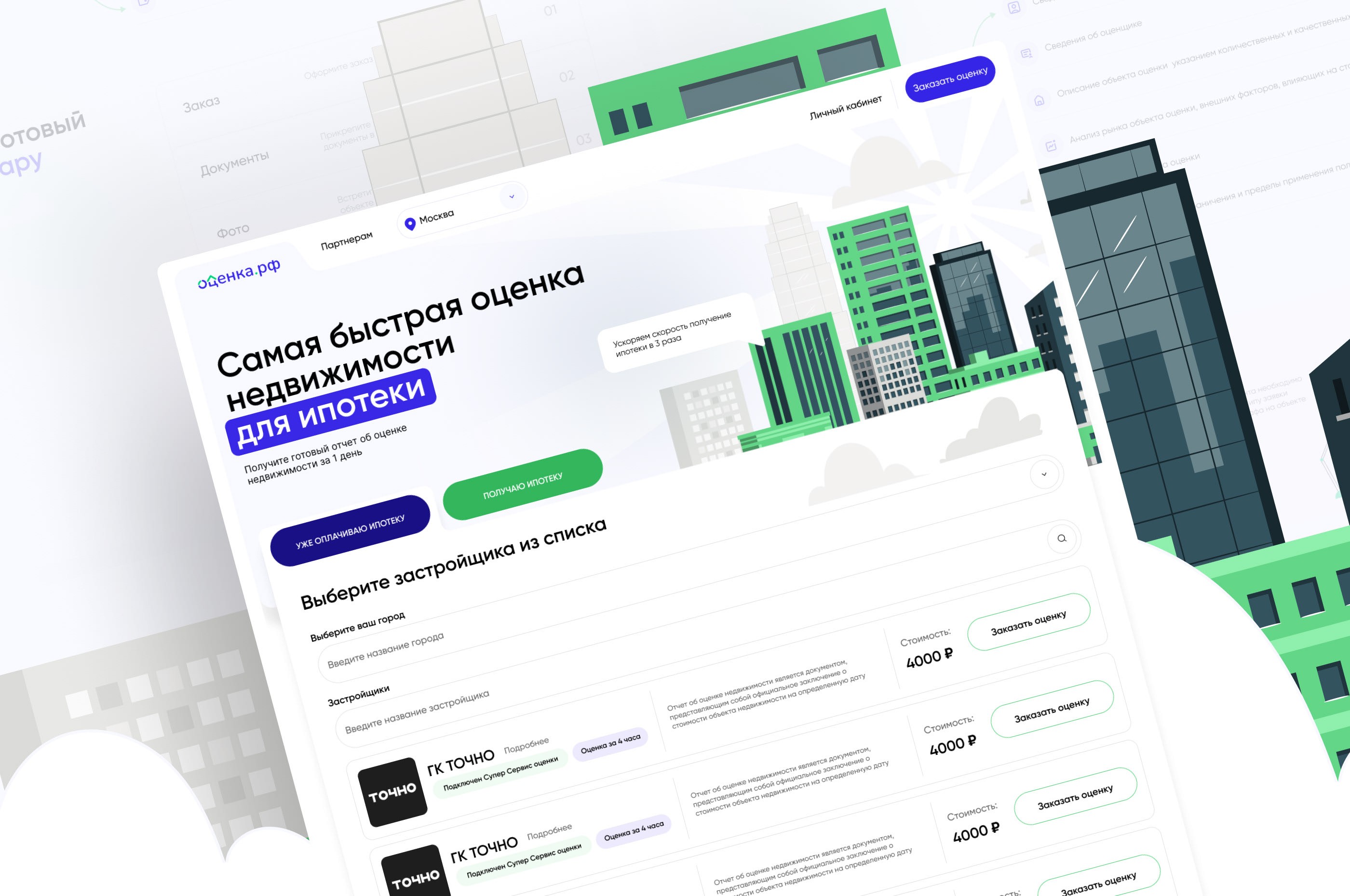
Ocenka is a real estate portal serving both property buyers (B2C) and real estate professionals (B2B). The existing site had a usability problem that was generating measurable costs: support tickets about navigation were consuming team time, and mobile users were converting at a significantly lower rate than desktop users.
The Tab-Based Navigation Solution
The previous site used a traditional menu structure that forced B2B and B2C users through the same navigation paths. A property buyer looking for apartment listings and a real estate appraiser looking for professional tools had to navigate the same menu, creating confusion for both audiences.
We implemented a tab-based navigation system that immediately separated the two experiences. Users self-select their role on entry — a clear “I’m looking for property” versus “I’m a professional” choice — and the entire navigation, content, and feature set adapts accordingly.
Measurable Outcomes
Support tickets related to navigation decreased after the redesign. Users were finding what they needed without contacting support for help. This is one of the most underappreciated ROI metrics for website redesigns — reduced support costs do not show up in Google Analytics, but they show up in the budget.
Mobile conversion improved as the tab-based system translated cleanly to small screens. On mobile, the B2B/B2C selection became a prominent toggle at the top of every page, keeping the user’s context clear even on limited screen real estate.
Timeline: 2 weeks from kickoff to delivery. The speed was possible because the project was scoped as a UX redesign — same brand, same content, restructured navigation and user flows.
Case 4: Jardins d’Etretat — Interactive Museum Experience
Jardins d’Etretat is a contemporary art garden and museum in Normandy, France. Their website needed to communicate an experience that is inherently visual and spatial — walking through sculpted gardens overlooking chalk cliffs while encountering contemporary art installations.
A standard corporate website with text descriptions and a photo gallery would not capture what makes this place unique. The redesign focused on two interactive elements: an explorable map of the gardens and an immersive gallery system.
The interactive map lets visitors plan their route through the gardens before arriving. Each garden area — the Emotions Garden, the Zen Garden, the Impressionist Garden — is clickable, revealing the art installations and landscape features within. This serves both a practical function (trip planning) and a marketing function (showing visitors what to expect, building anticipation).
The gallery system goes beyond a standard image carousel. Full-screen photography with smooth transitions creates a browsing experience that communicates the sensory quality of the gardens in a way that thumbnails in a grid cannot.
Platform: Built on Framer. The interactive elements were built using Framer’s native interaction capabilities without custom code, keeping the site maintainable and editable by the museum team.
What Actually Drives Redesign ROI
Across these four projects, the highest-ROI changes fall into three categories.
1. Reducing Steps in Critical Flows
Jumpman’s booking flow went from five steps to two and bookings doubled. This pattern repeats everywhere: every unnecessary click, form field, or page load in a conversion flow costs you 10-20% of the users at that step. Audit your most important user flow — sign-up, purchase, booking, contact — and count the steps. If it is more than three, you are losing conversions.
2. Separating Distinct Audiences
Both Jumpman (B2C/B2B) and Ocenka (buyers/professionals) saw immediate improvements when different user types got distinct pathways. If your site serves multiple audiences with different needs, mixing them on the same pages creates confusion that analytics shows as high bounce rates and low time-on-page.
3. Mobile-First Performance
Not mobile-responsive — mobile-first. Responsive design means the desktop version shrinks to fit mobile screens. Mobile-first design means the mobile experience is designed first, and the desktop version expands from there. The difference is enormous when 60-80% of traffic comes from phones.
When to Redesign vs. When to Patch
A full redesign is not always the right answer. Here is how to decide.
Redesign when:
- Bounce rate exceeds 60% across the site, not just one page
- Your conversion funnel has more than 3 steps for the primary action
- You serve multiple audiences with different needs on the same pages
- Mobile conversion is less than half of desktop conversion
- The site is on an outdated platform that limits what you can build
Patch when:
- One or two specific pages underperform but the overall site works
- The issue is content (weak copy, missing information) rather than structure
- Your platform supports the changes you need
- SEO traffic is strong and a redesign risks losing rankings
Patching is faster and cheaper but has a ceiling. Redesigning costs more but removes structural limitations. The right choice depends on whether your problems are content-level or architecture-level.
Timeline and Cost Expectations
Based on these four projects and dozens of others:
- UX-focused redesign (existing brand, restructured flows): 2-4 weeks, lower end of budget range
- Full redesign with development (new visual language, new platform): 6-10 weeks, mid-range budget
- Redesign plus additional deliverables (deck + website, interactive features): 4-10 weeks, higher end of budget range
- Rush delivery (30-day full redesign): possible with dedicated team and fast client approvals
The most common cause of timeline overruns is not design complexity — it is approval delays. A project scoped for 6 weeks can take 12 if every design revision waits a week for feedback. The fastest projects have a single decision-maker with a 24-48 hour review commitment.
Why Framer for Redesigns
All four projects in this article were built on Framer, and the choice is deliberate. Framer occupies a specific niche: it gives designers near-complete control over layout, animation, and interaction while keeping the site editable by non-developers after launch.
For redesign projects specifically, Framer offers three advantages. First, responsive design is native — you design for desktop, tablet, and mobile in the same workspace, and breakpoints are part of the design process rather than an afterthought in code. Second, page speed is strong out of the box because Framer generates optimized static pages. Third, content updates (changing text, swapping images, adding pages) can be done by the client team without touching code or waiting for a developer.
This last point matters more than most businesses realize. A website that requires a developer for every text change will slowly drift out of date. A website that the marketing team can update directly stays current — and current content converts better than stale content.
Measuring ROI After Launch
Track these metrics starting from day one after launch:
- Primary conversion rate (bookings, purchases, sign-ups) compared to the 30 days before redesign
- Bounce rate on key landing pages
- Average session duration as a measure of engagement
- Mobile vs. desktop conversion gap — this should narrow after a mobile-first redesign
- Support ticket volume related to navigation or usability — a decrease here is direct cost savings
Set a 90-day window for evaluation. Some metrics improve immediately (Jumpman saw 2x bookings in month one). Others take time as SEO rankings stabilize and returning users adapt to the new navigation.
Do not make the mistake of measuring only revenue. Jumpman’s 2x bookings is the headline number, but the -41% drop-off and +54% session time are equally important because they indicate structural improvements that will compound over time. A lower drop-off rate means every future marketing campaign sends traffic to a site that converts better. A higher session time means visitors engage with more content, building more trust before they convert.
A website redesign is not a creative exercise. It is a business intervention with measurable returns. The design should be driven by what the numbers say is broken, and the success should be measured by whether those numbers improve. Everything else is decoration.
Questions people ask
How long does a website redesign take?
Timeline depends on scope. A UX-focused redesign of an existing site takes 2-4 weeks. A full redesign with new visual identity and development takes 6-10 weeks. Rush projects like Moboost's 30-day delivery are possible but require dedicated focus.
How much does a website redesign cost?
Redesigns range from $1,700 for focused UX improvements to $7,500+ for full multi-page builds with custom interactions. The cost depends on page count, complexity of interactions, and whether brand identity work is included.
How do I know if my website needs a redesign?
Key signals include bounce rate above 60%, session time under 1 minute, mobile conversion rate significantly lower than desktop, increasing support tickets about navigation, or a booking/purchase flow that requires more than 3 clicks.
Should I redesign my website or just fix specific pages?
If the core navigation and information architecture work but individual pages underperform, fix those pages. If users consistently struggle to complete key actions like booking or purchasing, a structural redesign will deliver better ROI than patching individual elements.
What platform is best for website redesigns?
We build most redesigns on Framer for its balance of design flexibility, performance, and ease of updates. It handles responsive design natively and allows non-developers to make content changes without breaking the layout.