DeFi Website Design: Bento-Style UI on Framer
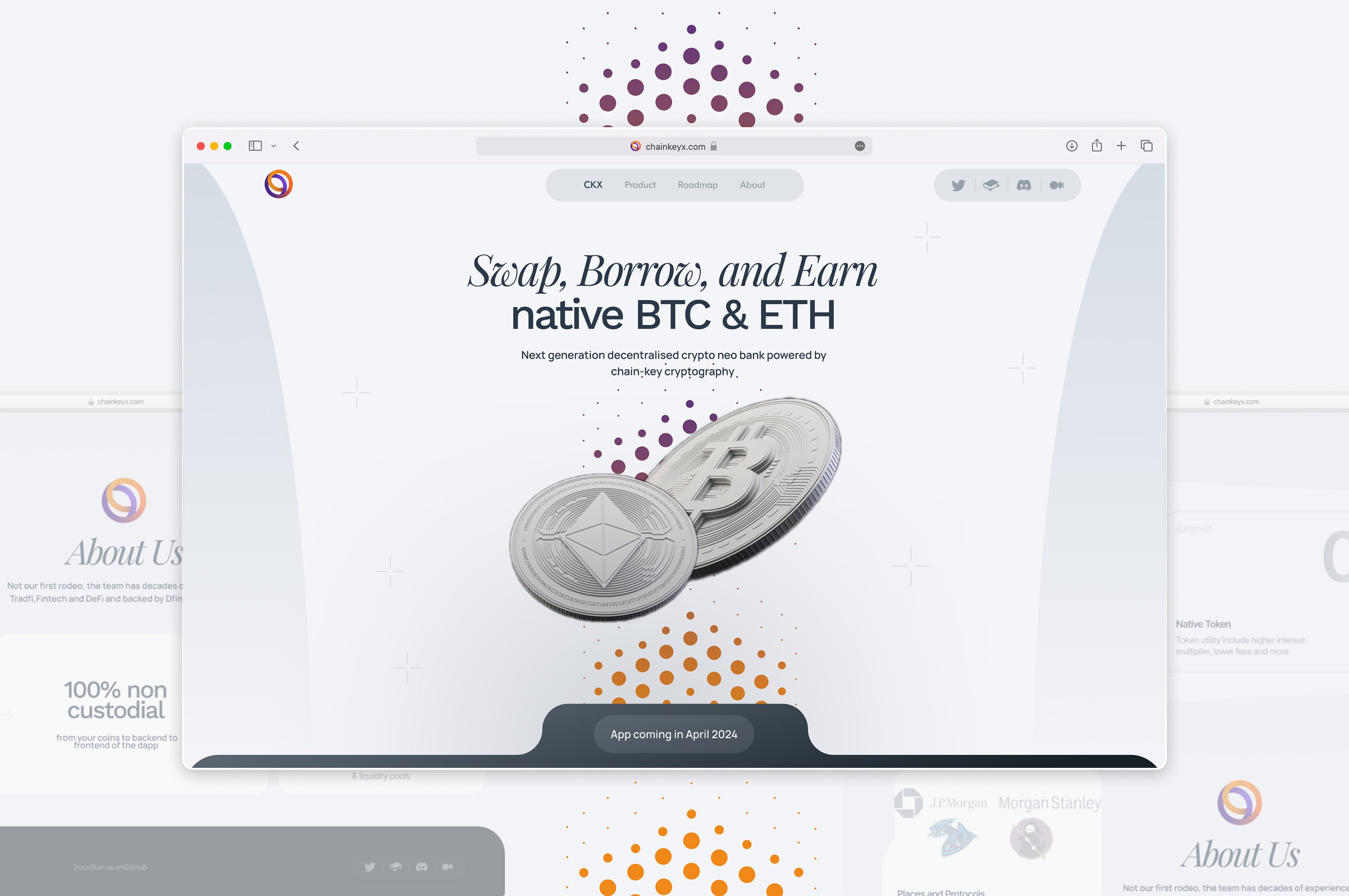
ChainKeyX is a Singapore-based DeFi platform offering crypto exchange, storage, and lending services. With investment rounds ahead — including one with J.P. Morgan — they needed a digital presence that could explain the platform, build trust, and scale with the product. The existing web presence was a basic placeholder page that did nothing to differentiate ChainKeyX from the thousands of crypto projects competing for investor attention.
The Brief
ChainKeyX needed more than a website. They needed:
- A landing page that could replace traditional investor decks
- A UX/UI foundation scalable with new features
- A trustworthy brand identity making crypto feel clear, safe, and intelligent
- A Framer-built site with speed, interactivity, and polish
The timeline was tight — the J.P. Morgan meeting was weeks away, and the website needed to be live and polished before that conversation happened.
Why Web3 Startups Need Strong UX
DeFi users are smart but wary. With thousands of projects launching daily, the bar is high:
- New users need clarity — interfaces must onboard without confusion
- Investors judge within seconds — if the product doesn’t feel legit, the round is lost
- Scalable design systems are non-negotiable — the product will evolve and the design must support that
In our experience, the gap between a technically strong crypto product and a funded one often comes down to presentation. The product has to feel as trustworthy as it actually is — and that is a design problem.
Website Design: Bento Style + Framer Development

We chose the bento-box layout because it naturally segments complex information into digestible blocks. Each card handles one concept — exchange rates, security architecture, lending terms — so visitors can scan the full value proposition without scrolling through dense paragraphs. We built the site in Framer, prioritizing:
- Visual simplicity with Web3-native UI language
- Lightweight animations to communicate tech confidence without slowing load times
- Responsive layout that grows with the product
- Clear feature presentation covering use cases and security
The dark-mode color scheme was intentional. It signals technical sophistication, aligns with crypto-native audience expectations, and provides strong contrast for data-heavy UI elements. A similar design philosophy drove our work on the Sardana defence-sector website.
UX/UI System for the Platform
To prepare for long-term product growth, we developed:
- A design system standardizing buttons, forms, data tables, and flows
- 10+ UX interaction scenarios built in Figma for key user journeys
- User journey improvements based on competitor analysis
- Data-heavy UI balancing readability and depth
The design system was built to be self-sufficient — ChainKeyX’s internal team could create new pages, add features, and update content without needing a designer for every change. Component documentation included usage rules, spacing guidelines, and color tokens that mapped directly to the Framer implementation.
Challenges We Solved

- Cross-cultural design sensitivity (Asia + Global) — Asian crypto markets value clean, structured aesthetics. We adapted visual cues and microcopy accordingly, avoiding Western-centric design patterns that could feel unfamiliar to the primary user base.
- Global team communication — Different accents, time zones, and async updates made miscommunication a risk. We documented everything, recorded calls, and kept sprint cycles tight. Figma comments and Loom walkthroughs replaced most live meetings.
- Investor-first thinking — Every section answered: “Why should I care?” and “Can I trust this?” We treated the landing page as a visual pitch deck, structuring the scroll flow to mirror the narrative arc of an investor presentation.
What Made This Project Unique
The website was not supplementary to the fundraising process — it was central to it. ChainKeyX’s team used the site in place of a traditional pitch deck during investor conversations, pulling up specific sections live during calls. This meant every page section needed to function both as a standalone reference and as part of a linear narrative. For teams exploring a similar approach, our article on designing websites that convert covers the underlying principles.
Results
- ChainKeyX launched a fully responsive, modular Framer site
- A scalable platform UI ready for future product rollouts
- The website played a key role in securing investment from J.P. Morgan
- The design system allows internal product teams to iterate independently
Frequently Asked Questions
Why is UX design critical for DeFi startups seeking investment?
Investors judge credibility within seconds. ChainKeyX's site replaced traditional pitch decks for investor meetings — its design directly contributed to securing backing from J.P. Morgan.
What is bento-style web design and why use it for crypto?
Bento layout uses modular, card-based blocks that help users focus on one feature at a time. It's efficient, familiar to crypto-savvy audiences, and scales easily as the product grows.
How long does a DeFi website and UX/UI project take?
Typically 3-5 weeks. For ChainKeyX, this included a responsive Framer website, a full design system, and 10+ UX interaction scenarios in Figma.
Like this work?
Let's discuss your project — we'll prepare a strategy and estimate within 48 hours.
Book a Call