Pitch Deck Design: What Gets Investor Meetings
4 pitch deck case studies with real timelines. How to structure narratives for investors and partners — from complex SaaS to fintech with zero customers.
Most startup pitch decks fail before anyone reads the financials. The problem is rarely the business itself — it is how the business is presented. Investors spend an average of 3 minutes and 44 seconds per deck, according to DocSend data. If your first three slides do not land, slides 10 through 20 never get seen.
Over the past year, we have designed pitch decks for startups across networking, edtech, SaaS analytics, and fintech. Each project had a different core challenge — but the patterns behind what works and what gets ignored are remarkably consistent.
Here are four cases, four different problems, and the design decisions that solved them.
Case 1: Koster — Making a Complex Concept Simple
Koster is a networking and dating platform built around group matching. Unlike traditional dating apps where two people swipe on each other, Koster matches groups — think double dates, friend groups meeting other friend groups. They had a working MVP and needed an investor deck to raise their next round.
The challenge was not a lack of substance. It was the opposite: the founding team had too much to say. Their existing materials were dense, technical, and structured like a product spec rather than a story. Every slide tried to explain the matching algorithm, the social dynamics research, the user psychology — all at once.
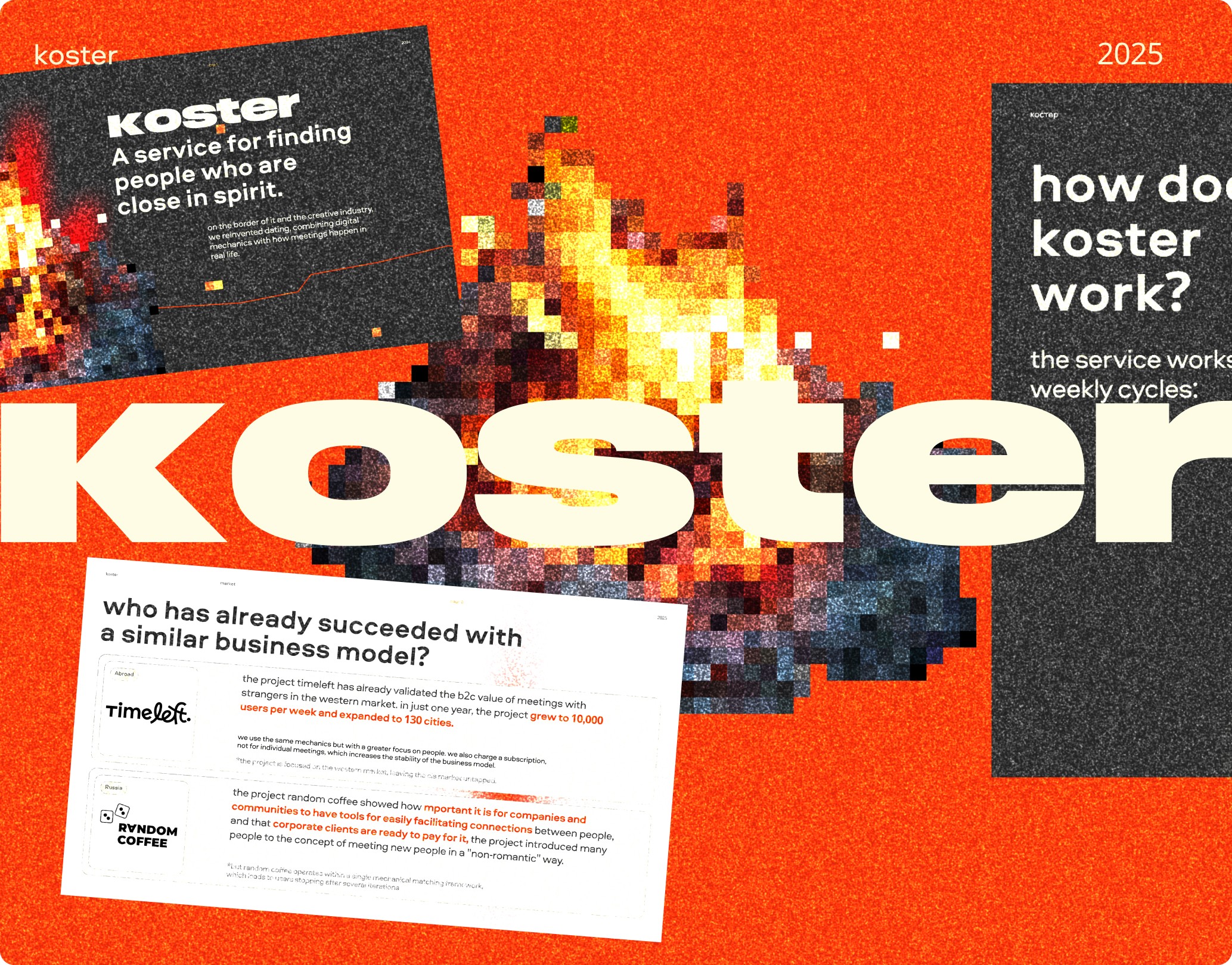
What We Changed
We restructured the entire narrative into a seven-part arc: problem, timing, audience, market, differentiation, unit economics, and financials. Each section got exactly the number of slides it needed — no more.
The problem slide showed one statistic: the percentage of dating app users who report “app fatigue.” No paragraph explanations. One number, one sentence, one visual.
For the differentiation section, we replaced a feature comparison table with a single diagram showing how group matching creates network effects that individual matching cannot. The concept that took three slides to explain in text became immediately clear as a visual.
We also built a brand visual identity alongside the deck. Koster did not have established brand guidelines, so the deck became the first expression of their visual language — color palette, typography, illustration style. This meant the deck was not just a fundraising tool but a brand foundation they could carry into their product and marketing.
Timeline: 2-4 weeks from kickoff to final delivery.
Case 2: LingoCulture — One Deck for Many Audiences
LingoCulture teaches French through cultural immersion — not grammar drills, but learning language through French cinema, cuisine, art, and daily life. They were building partnerships, not raising capital. Their target partners included universities, influencers, media outlets, and cultural organizations.
The previous deck was getting zero responses. Not rejections — silence. Partners opened it, maybe skimmed it, and moved on.
The core issue: a single narrative cannot resonate with four fundamentally different audiences. A university cares about accreditation and learning outcomes. An influencer cares about audience engagement and content opportunities. A media outlet cares about story angles and cultural relevance. A cultural organization cares about mission alignment.
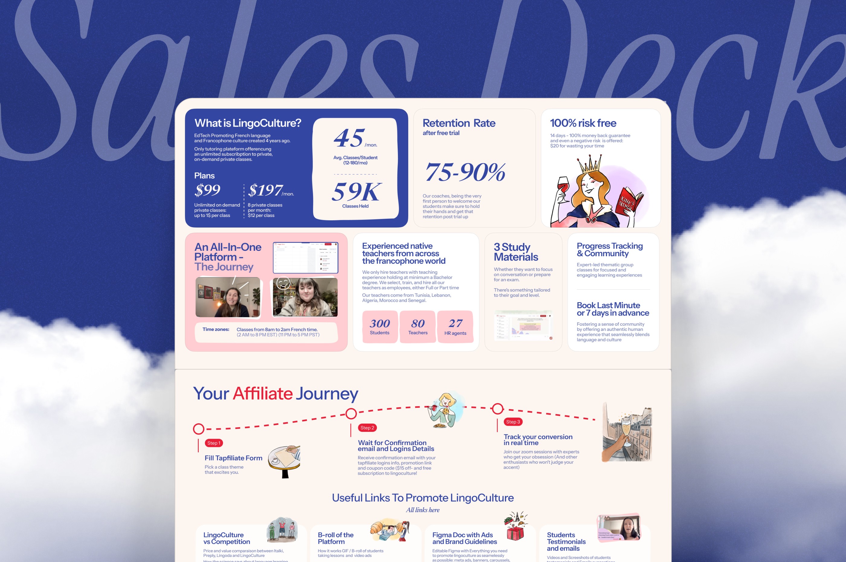
The Modular Approach
We designed the deck with swappable sections. The opening three slides — mission, method, and proof of concept — stayed constant. But the middle section was built as interchangeable modules: one for academic partners emphasizing curriculum integration, one for influencers emphasizing content collaboration, one for media emphasizing story angles, one for cultural organizations emphasizing mission overlap.
Each module was visually consistent but tailored in language, metrics, and case examples. The university module showed completion rates and learning outcomes. The influencer module showed engagement metrics and audience demographics. Same brand, same design system, different story for each reader.
This modular structure also made the deck a living document. As LingoCulture closed new partnerships, those became case studies that slotted into the relevant module without redesigning the entire deck.
Timeline: 1-2 weeks.
The modular deck approach is underused in startup fundraising, but it applies to any company pitching different stakeholders. A B2B SaaS company might need one version for enterprise buyers and another for channel partners. A marketplace might need different modules for supply-side and demand-side investors. The principle is the same: one brand identity, multiple stories tailored to what each reader needs to hear.
Case 3: StarViral — Translating Technical SaaS Into Visual Storytelling
StarViral is a marketing analytics platform. Their technology analyzes campaign performance across channels and predicts which creative assets will perform best. Powerful product — but the pitch deck read like an engineering whitepaper.
The founding team described their own product as a “black box.” They knew what it did, they knew it worked, but they struggled to explain the value in terms a non-technical investor could grasp in 30 seconds. Slides were filled with technical jargon: “multi-variate attribution modeling,” “cross-channel signal aggregation,” “predictive creative scoring.”
Custom Visual Systems Replace Jargon
We replaced every technical explanation with a custom flow diagram or infographic. The attribution model became a visual showing ad spend flowing into channels and converging on revenue — with StarViral sitting at the center, making the connections visible. The predictive scoring engine became a before-and-after comparison: a marketer guessing which ad to run versus StarViral showing which ad will win, with probability scores.
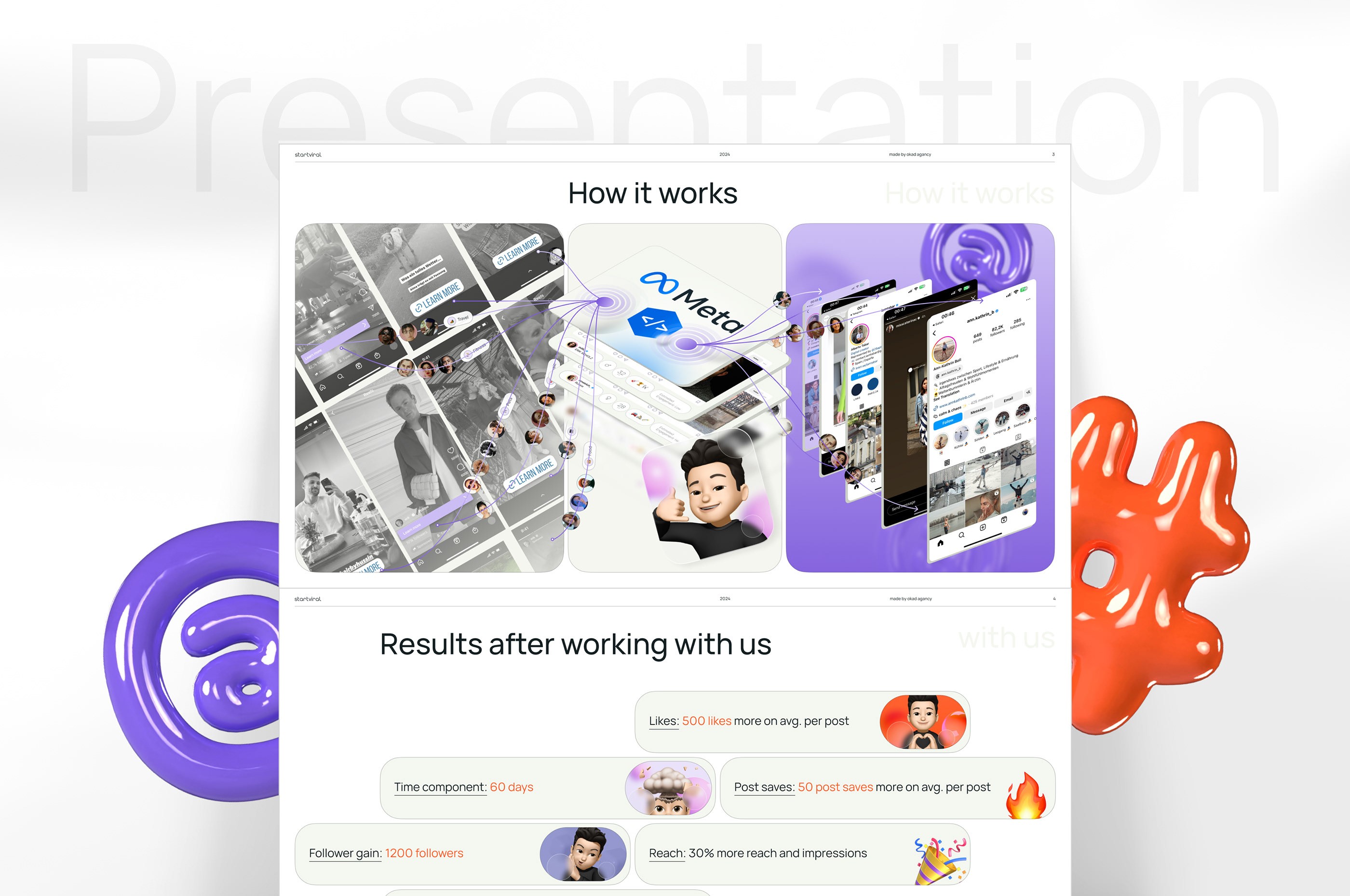
The dark blue color theme was deliberate. Analytics products need to feel precise and trustworthy. Bright colors and playful design work for consumer apps but undermine credibility for enterprise SaaS. The palette communicated “serious technology” without saying it.
This project went through 3-5 rounds of refinement — typical for SaaS decks where the product is genuinely complex. Each round focused on simplifying without losing accuracy. The goal was never to dumb down the technology but to make its value self-evident through visuals.
Timeline: 3-5 rounds of refinement over several weeks.
Case 4: Trusto — Launching Without Social Proof
Trusto is a fintech company focused on chargeback prevention. Their project was unique because it included both a pitch deck and a website, with the deck designed first and the website built on the same visual language.
The biggest challenge had nothing to do with design. Trusto was launching without customer reviews, testimonials, or case studies. Every “how to build a pitch deck” guide says to include social proof — but what do you do when you have none?
The Competitor Comparison Strategy
Instead of faking social proof or leaving a gap where testimonials should be, we leaned into competitor analysis and data-backed benefits. The deck included a detailed comparison showing how Trusto’s approach differed from existing chargeback solutions — not in vague terms but with specific metrics: processing time, false positive rates, integration complexity.
We used third-party industry data to establish the cost of chargebacks for businesses (an estimated $117.47 billion globally by 2023, according to Juniper Research) and positioned Trusto’s solution against that market reality. The message was not “our customers love us” but “here is the problem costing your business money, and here is how the math works with our solution.”
The deck-to-website pipeline saved significant time. Typography, color palette, iconography, illustration style, and messaging hierarchy were all established in the deck. When the website build started, the design system was already proven and approved.
Timeline: 4-6 weeks for both deck and website.
Common Mistakes We See in Every Pitch Deck Review
After designing dozens of decks, the same problems appear repeatedly. These are the issues that kill investor interest before the founder gets to the good parts.
Too Many Words Per Slide
If a slide has more than 40 words, it is trying to do too much. The deck supports your verbal pitch — it does not replace it. When investors read paragraphs on screen, they stop listening to you.
No Clear Story Arc
Random slide order is surprisingly common. Problem, solution, team, market, financials — that is a checklist, not a story. A compelling deck has narrative tension: here is the problem, here is why now, here is why us, here is how big this gets.
Generic Visuals
Stock photos, default PowerPoint charts, and template layouts tell investors you did not care enough to invest in your own presentation. If you are asking someone to invest millions in your company, the deck should look like you take your business seriously.
Missing the “Why Now” Slide
Every investor wants to know why this company should exist today and not five years ago or five years from now. Market timing is often the difference between a funded startup and a good idea that goes nowhere.
Financials Without Context
A revenue projection chart means nothing without the assumptions behind it. Show the unit economics, the customer acquisition cost, the conversion rates that drive the model. Investors do not believe hockey stick charts — they believe the math underneath.
What Investors Actually Look For in Deck Design
Design quality in a pitch deck is not about making things pretty. It signals three things investors care about:
Clarity of thinking. A well-structured deck suggests the founders think clearly about their business. If you cannot organize 15 slides into a coherent story, investors wonder how you will organize a company.
Attention to detail. Typos, misaligned elements, inconsistent fonts — these are red flags. Not because investors care about typography, but because carelessness in the deck suggests carelessness elsewhere.
Understanding of audience. A deck designed for investors looks different from a deck designed for partners or customers. Showing the right metrics, addressing the right concerns, and speaking the right language demonstrates market awareness.
Timeline and Pricing Expectations
Pitch deck projects vary widely based on scope:
- Partner deck with existing brand: 1-2 weeks, lower complexity.
- Investor deck with narrative development: 2-4 weeks, moderate complexity.
- Deck + website on shared visual language: 4-6 weeks, higher complexity.
- Technical SaaS requiring custom infographics: 3-5 rounds of refinement, timeline depends on feedback speed.
The fastest way to slow down a deck project is unclear feedback. “I do not like it” adds a week. “The market size slide needs to show TAM/SAM/SOM breakdown instead of a single number” adds a day.
The Deck-to-Website Pipeline
Trusto’s project revealed an approach worth highlighting separately. When you design a pitch deck and a website together, the deck becomes a brand prototype. Every visual decision — color palette, typography hierarchy, icon style, spacing system — gets tested in a low-stakes format (the deck) before being committed to a higher-stakes format (the website).
This pipeline saves time on the website phase because the design system is already built and approved. It also creates visual consistency across every touchpoint an investor or partner encounters. The deck they review, the website they visit afterward, and the product they eventually see all speak the same visual language. That consistency builds trust faster than any single piece of collateral can on its own.
For startups that need both a deck and a public-facing site, we recommend starting with the deck even if the website feels more urgent. The deck forces you to distill your story into its essential components. Those components become the foundation for website copy, page structure, and visual hierarchy.
When to Invest in Professional Deck Design
Not every pitch needs a designer. If you are pitching friends and family or applying to an accelerator, a clean Google Slides deck with good content is enough.
Professional design becomes worth the investment when:
- You are raising a seed round or Series A where first impressions filter you in or out
- Your product is technically complex and needs visual explanation
- You are pitching multiple audience types and need modular flexibility
- Your deck is also establishing your brand visual identity for the first time
- Previous decks have been getting no responses despite a strong business
The return on professional deck design is not measured in aesthetics — it is measured in meetings booked, responses received, and rounds closed. A $3,000 deck that secures a $500,000 seed round has an ROI that no other marketing spend can match.
The deck is not the business. But it is the first 3 minutes and 44 seconds of the business that anyone outside your team will ever see. Those minutes either open the door to a conversation or close it permanently.
Questions people ask
How much does a professional pitch deck cost?
Most pitch deck projects range from $2,000 to $5,000 depending on complexity, number of slides, and whether custom infographics or data visualizations are needed. Decks that require brand identity work alongside the presentation cost more.
How long does it take to design a pitch deck?
Typical timelines range from 1 to 6 weeks. A partner deck with existing brand guidelines takes 1-2 weeks. An investor deck requiring narrative development and visual identity takes 2-4 weeks. Combined deck + website projects take 4-6 weeks.
What should be in a startup pitch deck?
The essential structure covers problem, timing, audience, market size, differentiation, unit economics, and financials. Every slide should answer one question and advance the story. Investors spend an average of 3 minutes per deck — clarity beats completeness.
Can I use a pitch deck template instead of custom design?
Templates work for internal presentations but rarely for fundraising. Investors see hundreds of decks monthly and recognize template layouts instantly. Custom design signals that you take your business seriously enough to invest in how you present it.
What is the biggest mistake founders make with pitch decks?
Putting too much information on each slide. The deck is not your business plan — it is a conversation starter. If a slide needs more than 30 seconds to understand, it has too much content. Let the appendix hold the details.