Real Estate Portal UX Redesign in 2 Weeks
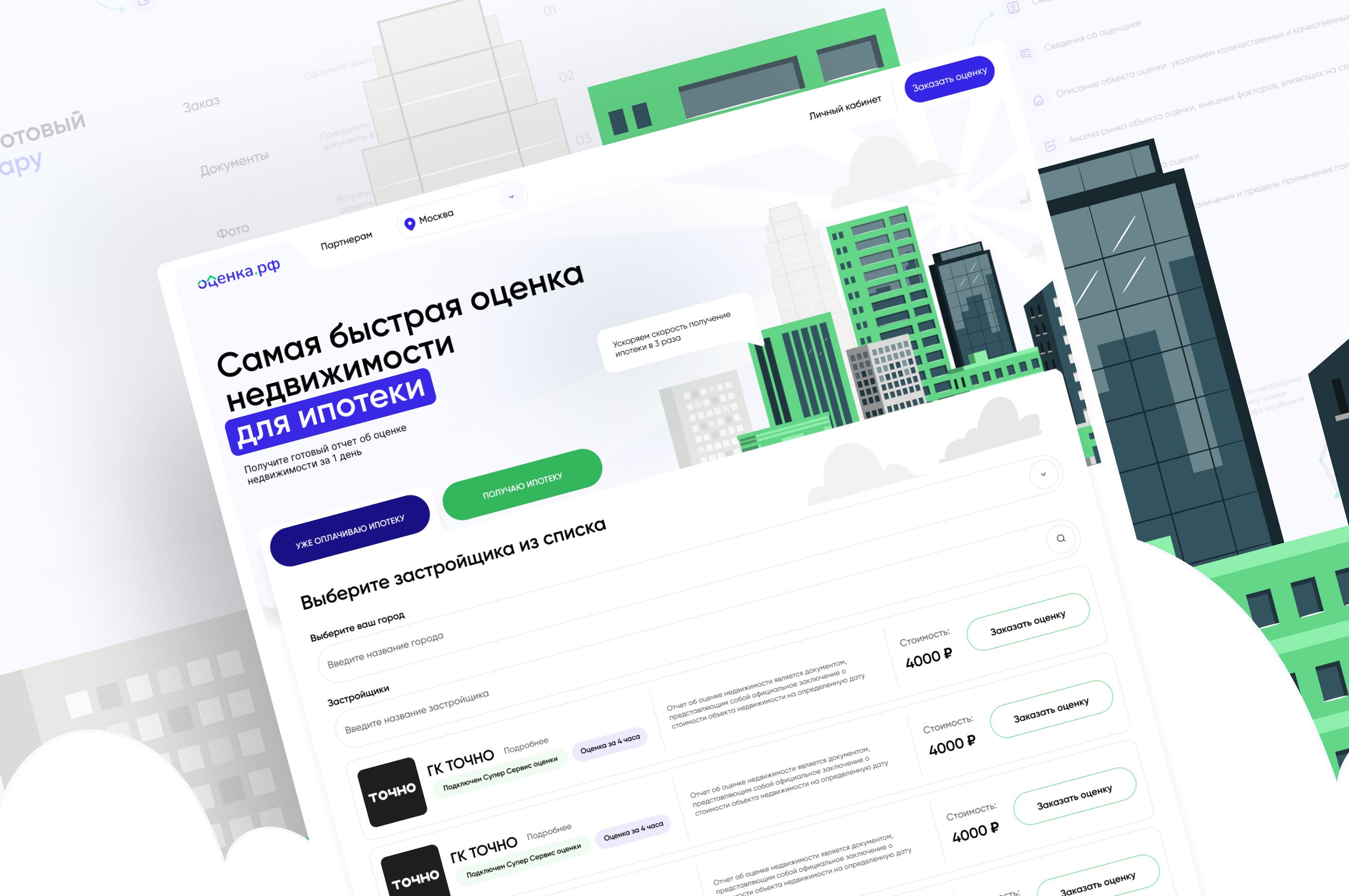
Ocenka RF is a real estate evaluation service for mortgage applicants and professionals needing certified valuation reports. After a failed attempt by a previous agency, the client needed a fast, effective redesign of their portal and personal account system — delivered within weeks. The previous redesign had stalled for months, leaving the team with an outdated interface that was driving up support costs and losing users at critical conversion points.
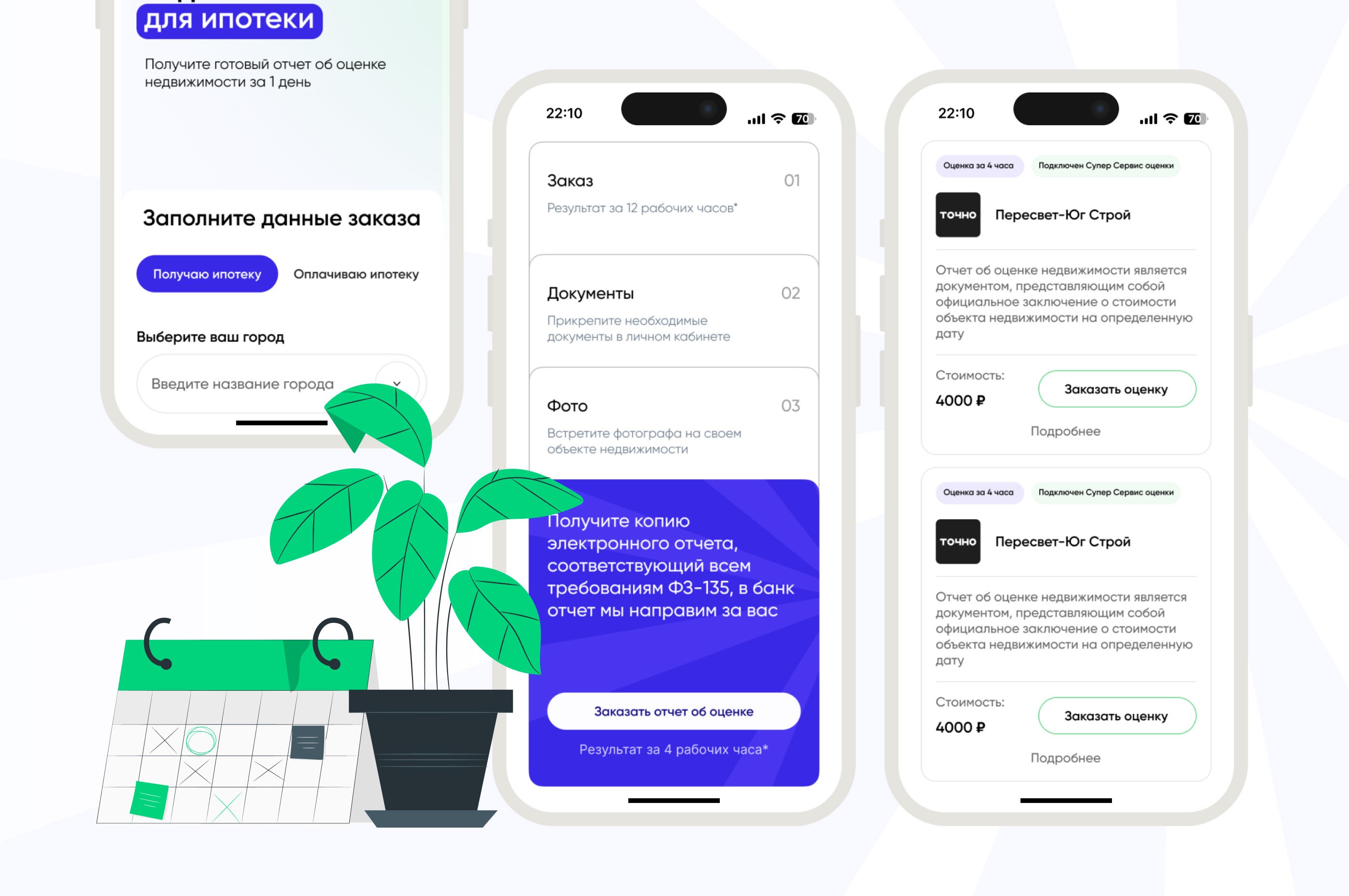
Project Background
Our mission was to build a modern UX/UI system that made it easy for users to:
- Submit property data through a clear, guided flow
- Receive detailed reports presented visually, not as raw documents
- Track evaluation status with real-time dashboard updates
- Navigate across devices without frustration
We delivered a fully functional design in 2 weeks, while also elevating the brand’s digital perception. The compressed timeline was non-negotiable — the client had already lost months with the previous agency and needed to launch before the next mortgage reporting deadline.
Core Challenges
- Tight deadlines — The client had a strict go-live timeline. We worked in agile sprints with rapid feedback loops, simultaneously designing for desktop, tablet, and mobile. Daily standups kept alignment tight, and we shared interactive Figma prototypes after each sprint rather than waiting for polished deliverables.
- Visually dry content — The core product was a 40-page property evaluation report. Presenting it in an appealing way was critical to avoid user fatigue. Users needed to find specific data points quickly without reading the entire document, which meant rethinking how information was structured and surfaced.
- Confusing UX for multiple audiences — Two main user groups (evaluation clients and mortgage report users) each needed clear paths with minimal overlap. The old interface combined both flows into a single navigation, forcing users to filter out irrelevant options at every step.
UX/UI Solutions
Tab-Based Interaction
The homepage uses tabs to let users quickly identify their path: “For Individuals” vs. “For Mortgage Clients.” This simple UX pattern drastically reduces cognitive load from the start. Users see only the information, forms, and CTAs relevant to their situation — no filtering required.
Illustration-Focused UI
Instead of showcasing long, text-heavy documents, we built the interface around custom illustrations that visualize key steps and reassure users. Each stage of the evaluation process — submission, review, report delivery — is represented visually, so users always know where they are in the workflow.
Minimalist UI with Smart Animations
We kept the interface clean — white space, intuitive spacing, soft transitions — and used microanimations to communicate states (loading, success, error) without overwhelming the user. These small touches made the portal feel responsive and modern, reinforcing the brand’s professionalism.
Responsive by Default
The portal was designed for all three screen types (desktop, tablet, mobile) from the beginning, ensuring consistent experiences everywhere. Given that a significant portion of mortgage applicants access the portal from their phones during property viewings, mobile usability was not an afterthought — it was a primary design constraint.
Admin-Side Simplicity
We made sure the backend team could easily update report statuses, trigger notifications, and access user data from a clean internal layout. Reducing admin friction was just as important as improving the client-facing experience — if the internal team struggles with the tool, service quality drops.

What Made This Project Unique
The two-week delivery timeline forced us to be ruthless about scope. Instead of trying to redesign everything, we identified the three highest-impact user flows — property submission, report viewing, and status tracking — and focused all design effort there. Everything else was left intentionally simple. This constraint-driven approach actually produced a better product: by not overdesigning peripheral features, we kept the interface focused and easy to maintain. We apply similar principles across all our UX work, including the mental health app MVP redesign and our broader thinking on designing websites that convert.
Results
- Delivery within 2 weeks, including all key flows and responsive versions
- Reduced support inquiries through an intuitive dashboard
- Better mobile conversion through clearer call-to-actions
- Improved trust perception of the platform’s professionalism
- B2B partner retention thanks to clear mortgage-client logic separation
The redesign restored the client’s confidence after a difficult experience with the previous agency, and the portal has been running on the new design system since launch without requiring a second redesign cycle.
Frequently Asked Questions
How long did the portal redesign take?
We delivered the full redesign — including all key flows and responsive versions for desktop, tablet, and mobile — in 2 weeks.
Can you design for both B2B and B2C users in one interface?
Yes. We used tab-based navigation to separate flows for individual property owners and mortgage clients, reducing cognitive load for both groups.
What impact did the redesign have on support tickets?
The intuitive dashboard reduced customer support inquiries, and clearer CTAs on mobile improved conversion rates.
Like this work?
Let's discuss your project — we'll prepare a strategy and estimate within 48 hours.
Book a Call