Color Psychology in Web Design: Boost Your Conversions with Strategic Gradients and Bold Choices
Marketing
3
min reading
March 30, 2025
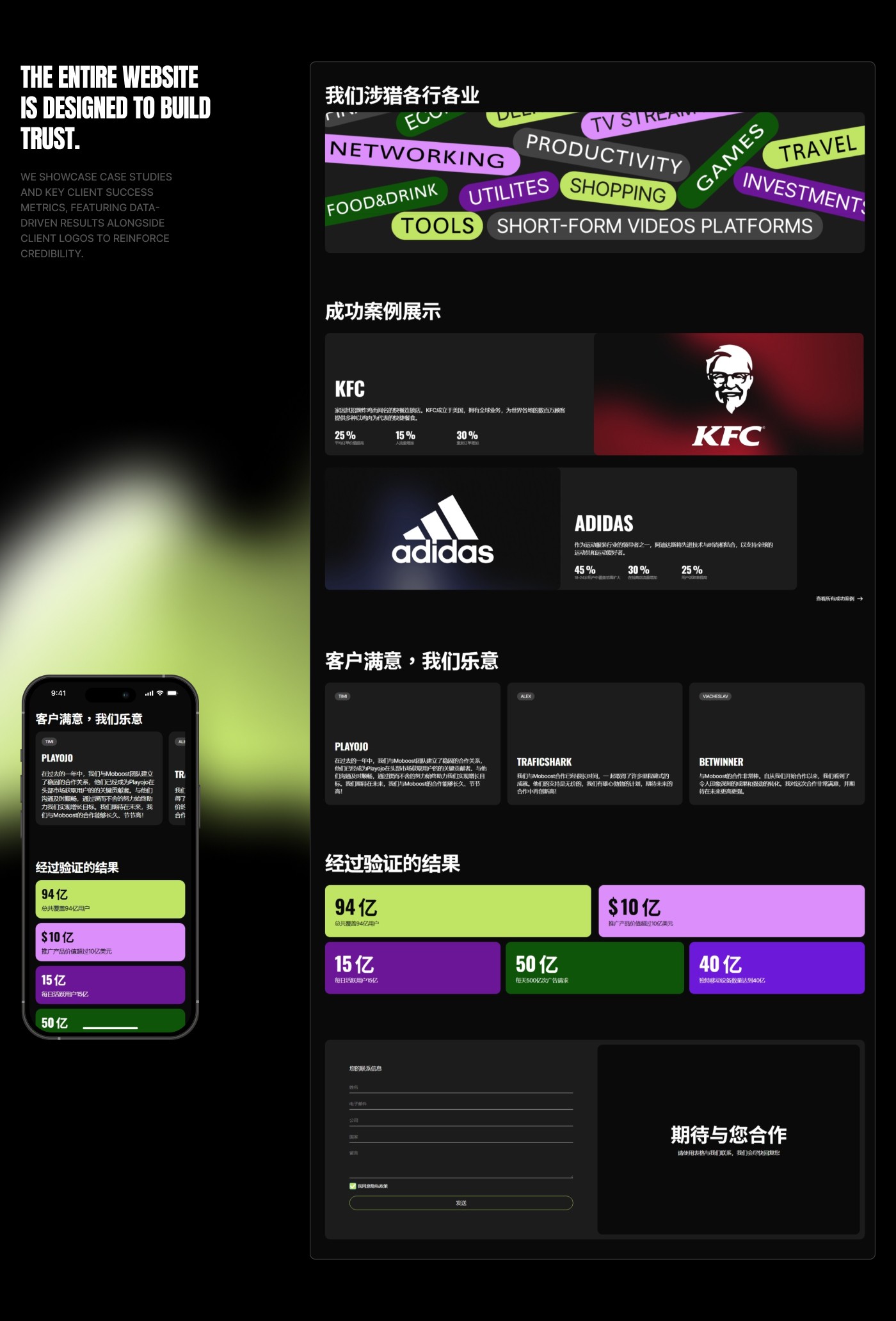
Ever wondered why some websites immediately grab your attention while others feel forgettable? The secret often lies in their color choices. At OKAD Agency, our recent collaboration with Moboost—a leading advertising platform serving top brands like Adidas and HBO—showed firsthand how strategic color use can significantly enhance website engagement and conversion rates.

Why Colors Matter in Web Design
Colors evoke powerful emotional responses and influence user behaviors subconsciously. Strategic color selection can reinforce brand identity, enhance visual appeal, and increase user engagement.
The Psychology Behind Colors
Blue: Associated with trust, reliability, and professionalism—excellent for corporate brands.
Red: Signifies urgency, passion, and action—perfect for driving user engagement and prompting quick decisions.
Green: Conveys growth, stability, and harmony—suitable for finance or wellness sectors.
Purple: Symbolizes creativity, luxury, and sophistication—ideal for innovative and high-end brands.
Yellow: Represents optimism, creativity, and energy—effective for grabbing attention.
For Moboost, we selected vibrant gradients combining bold reds, purples, and blues to create a dynamic visual experience that instantly differentiates their website from competitors.
How We Applied Color Psychology for Moboost
Attention-Grabbing Gradients: We used gradients strategically to guide users' eyes toward critical areas such as CTA buttons, product benefits, and key messages, enhancing navigation and increasing conversions.
Balancing Creativity and Professionalism: By combining vibrant hues with structured layouts, we maintained a professional yet innovative brand image that appealed to Moboost’s corporate clientele.
Testing and Refinement: Multiple color variations were rigorously tested to determine the most effective combinations, ensuring maximum visual impact and engagement.
The Results: More Than Just Visual Appeal
Implementing these color strategies resulted in increased user engagement, lower bounce rates, and significantly higher conversion rates. Users spent more time interacting with content, ultimately translating into increased leads and sales for Moboost.
Practical Tips for Using Colors Strategically
Clearly define your brand personality and select colors that align with it.
Use color contrasts to highlight calls-to-action and crucial information.
Regularly test color variations to find the most effective combinations.
Ensure consistency in your color palette to strengthen brand recognition.
Ready to Transform Your Website with Powerful Colors?
At OKAD Agency, we understand the art and science behind effective color use in web design. Contact us today, and let's craft a visually stunning, high-converting online presence tailored for your brand.
FAQs
Why is color psychology important in web design? Color psychology influences user emotions and behaviors, helping increase engagement, brand recognition, and conversion rates.
What should I consider when choosing website colors? Consider your target audience, brand identity, emotional responses associated with colors, and visual harmony within your design.
Can bold colors work for professional or corporate websites? Absolutely. Strategic use of bold colors, paired with professional layouts and clear structure, can enhance a corporate image by communicating innovation and confidence.
How often should I test or update my website’s colors? Regular testing and analysis, ideally quarterly, help ensure your color scheme remains effective and aligned with audience preferences and evolving trends.
Ever wondered why some websites immediately grab your attention while others feel forgettable? The secret often lies in their color choices. At OKAD Agency, our recent collaboration with Moboost—a leading advertising platform serving top brands like Adidas and HBO—showed firsthand how strategic color use can significantly enhance website engagement and conversion rates.
Why Colors Matter in Web Design
Colors evoke powerful emotional responses and influence user behaviors subconsciously. Strategic color selection can reinforce brand identity, enhance visual appeal, and increase user engagement.
The Psychology Behind Colors
Blue: Associated with trust, reliability, and professionalism—excellent for corporate brands.
Red: Signifies urgency, passion, and action—perfect for driving user engagement and prompting quick decisions.
Green: Conveys growth, stability, and harmony—suitable for finance or wellness sectors.
Purple: Symbolizes creativity, luxury, and sophistication—ideal for innovative and high-end brands.
Yellow: Represents optimism, creativity, and energy—effective for grabbing attention.
For Moboost, we selected vibrant gradients combining bold reds, purples, and blues to create a dynamic visual experience that instantly differentiates their website from competitors.
How We Applied Color Psychology for Moboost
Attention-Grabbing Gradients: We used gradients strategically to guide users' eyes toward critical areas such as CTA buttons, product benefits, and key messages, enhancing navigation and increasing conversions.
Balancing Creativity and Professionalism: By combining vibrant hues with structured layouts, we maintained a professional yet innovative brand image that appealed to Moboost’s corporate clientele.
Testing and Refinement: Multiple color variations were rigorously tested to determine the most effective combinations, ensuring maximum visual impact and engagement.
The Results: More Than Just Visual Appeal
Implementing these color strategies resulted in increased user engagement, lower bounce rates, and significantly higher conversion rates. Users spent more time interacting with content, ultimately translating into increased leads and sales for Moboost.
Practical Tips for Using Colors Strategically
Clearly define your brand personality and select colors that align with it.
Use color contrasts to highlight calls-to-action and crucial information.
Regularly test color variations to find the most effective combinations.
Ensure consistency in your color palette to strengthen brand recognition.
Ready to Transform Your Website with Powerful Colors?
At OKAD Agency, we understand the art and science behind effective color use in web design. Contact us today, and let's craft a visually stunning, high-converting online presence tailored for your brand.
FAQs
Why is color psychology important in web design? Color psychology influences user emotions and behaviors, helping increase engagement, brand recognition, and conversion rates.
What should I consider when choosing website colors? Consider your target audience, brand identity, emotional responses associated with colors, and visual harmony within your design.
Can bold colors work for professional or corporate websites? Absolutely. Strategic use of bold colors, paired with professional layouts and clear structure, can enhance a corporate image by communicating innovation and confidence.
How often should I test or update my website’s colors? Regular testing and analysis, ideally quarterly, help ensure your color scheme remains effective and aligned with audience preferences and evolving trends.


Like our designs
& visual storytelling?
Like our designs and
visual storytelling?
Like our designs and visual storytelling?
Like our designs and visual storytelling?
Like our designs
& visual storytelling?
Starting to work
with us is easy!
Starting to work
with us is easy!
Starting to work with us is easy!
Starting to work
with us is easy!
Starting to work
with us is easy!
Fill out the brief about your project,
we'll get in touch with you.
Fill out the brief about your project, we'll get in touch with you.
Fill out the brief about your project, we'll get in touch with you.

Recommended articles
Recommended articles


Discuss the project
Write to us about your idea and we will calculate the cost of the work, as well as offer a step-by-step project management.
Discuss the project
Write to us about your idea and we will calculate the cost of the work, as well as offer a step-by-step project management.
Discuss the project
Write to us about your idea and we will calculate the cost of the work, as well as offer a step-by-step project management.
Discuss the project
Write to us about your idea and we will calculate the cost of the work, as well as offer a step-by-step project management.
Discuss the project
Write to us about your idea and we will calculate the cost of the work, as well as offer a step-by-step project management.
Discuss the project
Write to us about your idea and we will calculate the cost of the work, as well as offer a step-by-step project management.
Our Projects
© 2024 Miller O.V. All rights reserved.
Our Projects
© 2024 Miller O.V. All rights reserved.
Our Projects
© 2024 Miller O.V. All rights reserved.
Our Projects
© 2024 Miller O.V. All rights reserved.