Dashboard Redesign in Two Weeks: How We Simplified the Property Evaluation Service
Design
9
min reading
April 25, 2025
If your product is hard to use, people won’t just drop off — they’ll flee.
In digital services where users are already overwhelmed (think mortgages, evaluations, paperwork), poor UX isn't just an inconvenience — it's a conversion killer. Platforms that fail to simplify complex processes risk becoming obsolete, especially when the competition is just one frictionless click away.Why UX/UI Can Make or Break Real Estate Tech Products

In technical industries like property evaluation or mortgage processing, users don’t have time—or patience—for clunky interfaces. When a process is already stressful (like getting a home loan), every confusing step feels like a dealbreaker. A bad dashboard doesn't just delay decisions — it loses customers. Platforms that fail to simplify complexity will quickly be replaced by those that do. In a service category where reports are mandatory and time-sensitive, usability isn’t a luxury. It’s the entire business model.
Project Background
Ocenka RF is a real estate evaluation service focused on clients applying for mortgages and professionals needing certified valuation reports. The client came to us after a failed attempt by a previous agency, looking for a fast and effective redesign of their portal and personal account system. The stakes were high: they needed something live and functional in a matter of weeks.
Our mission was to build a modern UX/UI system that made it easy for users to:
Submit property data
Receive detailed reports
Track their evaluation status
Navigate across devices without frustration
We delivered a fully functional design in just 2 weeks, while also elevating the brand’s digital perception.
Core Challenges
Tight deadlines
The client had a strict go-live timeline. We worked in agile sprints with rapid feedback loops, simultaneously designing for desktop, tablet, and mobile.Visually dry content
The core product was a 40-page property evaluation report. Presenting it in an appealing way was critical to avoid user fatigue.Confusing UX for multiple audiences
There were two main user groups—those ordering evaluations, and those tracking mortgage reports. Both needed clear paths with minimal overlap.
Our UX/UI Solutions
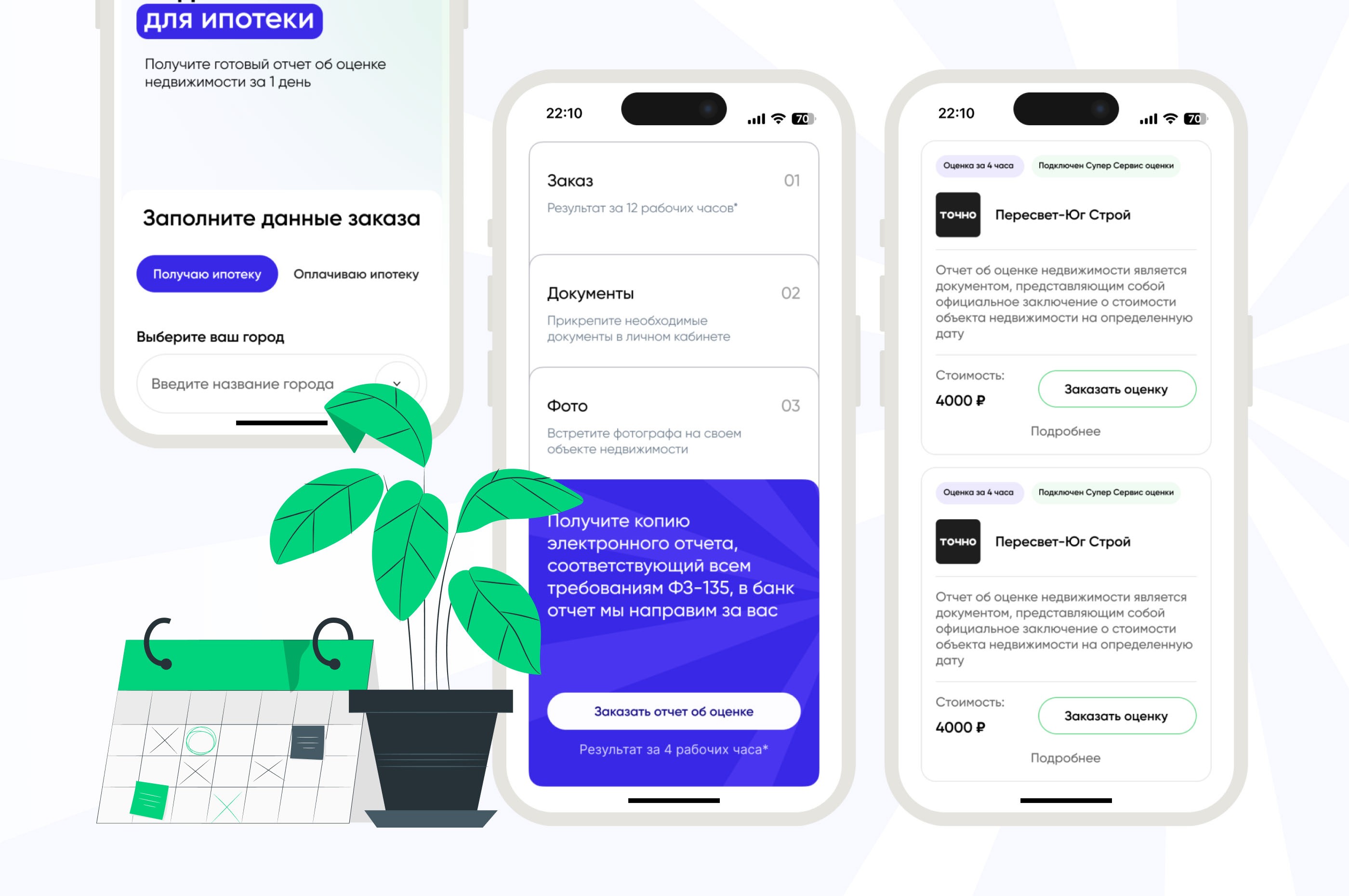
1. Tab-Based Interaction
The homepage uses tabs to let users quickly identify their path: "For Individuals" vs. "For Mortgage Clients". This simple UX pattern drastically reduces cognitive load from the start.
2. Illustration-Focused UI
Instead of showcasing long, text-heavy documents, we built the interface around custom illustrations that visualize key steps and reassure users.
3. Minimalist UI + Smart Animations
We kept the interface clean—white space, intuitive spacing, soft transitions—and used microanimations to communicate states (loading, success, error) without overwhelming the user.
4. Responsive by Default
The portal was built with full responsiveness in mind. We designed for all three screen types (desktop, tablet, mobile) from the beginning, ensuring consistent experiences everywhere.
5. Admin-side Simplicity
Though this was a client-facing product, we made sure that the backend team could easily update report statuses, trigger notifications, and access user data from a clean, internal layout.

Results
Delivery within 2 weeks, including all key flows and responsive versions
Intuitive dashboard that reduced customer support inquiries
Better conversion on mobile through clearer call-to-actions
Improved perception of the platform’s trustworthiness and technical professionalism
Retention of B2B partners, thanks to the clear mortgage-client logic separation
Educational Takeaways
If you're building a product in a regulated or high-stress domain, your UX can’t just "look good" — it needs to function invisibly. Every extra click is friction. Every delay feels like risk. The goal of good UX in services like real estate evaluation isn’t delight — it’s clarity, trust, and relief.
Here’s what other startups in similar domains can learn:
Use illustrations to humanize technical processes
Invest in responsive design from day one
Separate logic for different user roles early on
Use tabs and collapsible elements to hide complexity
Microinteractions build trust — especially with older or stressed users
Need a user-friendly dashboard or portal? Let’s make your product usable — and lovable
Your current platform might work — but does it work well?
If you're building or scaling a product with technical content and multiple users, we can help simplify, clarify, and humanize it.
Let’s talk → https://tally.so/r/3jElgx

Frequently Asked Questions (FAQ)
How long does a dashboard or portal redesign usually take?
It depends on complexity. In this case, we delivered everything in just 2 weeks.
Can you handle both B2B and B2C flows in one interface?
Yes — we specialize in designing multi-user systems with tailored UX for each role.
What if my product is boring?
We specialize in turning complex, unsexy services into clean, human-centered interfaces.
Can you work with tight deadlines?
Absolutely. This case was delivered in two weeks — and we’ve done tighter sprints.
Do you offer development too?
We partner with dev teams and can support no-code/low-code implementation depending on scope.
If your product is hard to use, people won’t just drop off — they’ll flee.
In digital services where users are already overwhelmed (think mortgages, evaluations, paperwork), poor UX isn't just an inconvenience — it's a conversion killer. Platforms that fail to simplify complex processes risk becoming obsolete, especially when the competition is just one frictionless click away.Why UX/UI Can Make or Break Real Estate Tech Products
In technical industries like property evaluation or mortgage processing, users don’t have time—or patience—for clunky interfaces. When a process is already stressful (like getting a home loan), every confusing step feels like a dealbreaker. A bad dashboard doesn't just delay decisions — it loses customers. Platforms that fail to simplify complexity will quickly be replaced by those that do. In a service category where reports are mandatory and time-sensitive, usability isn’t a luxury. It’s the entire business model.
Project Background
Ocenka RF is a real estate evaluation service focused on clients applying for mortgages and professionals needing certified valuation reports. The client came to us after a failed attempt by a previous agency, looking for a fast and effective redesign of their portal and personal account system. The stakes were high: they needed something live and functional in a matter of weeks.
Our mission was to build a modern UX/UI system that made it easy for users to:
Submit property data
Receive detailed reports
Track their evaluation status
Navigate across devices without frustration
We delivered a fully functional design in just 2 weeks, while also elevating the brand’s digital perception.
Core Challenges
Tight deadlines
The client had a strict go-live timeline. We worked in agile sprints with rapid feedback loops, simultaneously designing for desktop, tablet, and mobile.Visually dry content
The core product was a 40-page property evaluation report. Presenting it in an appealing way was critical to avoid user fatigue.Confusing UX for multiple audiences
There were two main user groups—those ordering evaluations, and those tracking mortgage reports. Both needed clear paths with minimal overlap.
Our UX/UI Solutions
1. Tab-Based Interaction
The homepage uses tabs to let users quickly identify their path: "For Individuals" vs. "For Mortgage Clients". This simple UX pattern drastically reduces cognitive load from the start.
2. Illustration-Focused UI
Instead of showcasing long, text-heavy documents, we built the interface around custom illustrations that visualize key steps and reassure users.
3. Minimalist UI + Smart Animations
We kept the interface clean—white space, intuitive spacing, soft transitions—and used microanimations to communicate states (loading, success, error) without overwhelming the user.
4. Responsive by Default
The portal was built with full responsiveness in mind. We designed for all three screen types (desktop, tablet, mobile) from the beginning, ensuring consistent experiences everywhere.
5. Admin-side Simplicity
Though this was a client-facing product, we made sure that the backend team could easily update report statuses, trigger notifications, and access user data from a clean, internal layout.
Results
Delivery within 2 weeks, including all key flows and responsive versions
Intuitive dashboard that reduced customer support inquiries
Better conversion on mobile through clearer call-to-actions
Improved perception of the platform’s trustworthiness and technical professionalism
Retention of B2B partners, thanks to the clear mortgage-client logic separation
Educational Takeaways
If you're building a product in a regulated or high-stress domain, your UX can’t just "look good" — it needs to function invisibly. Every extra click is friction. Every delay feels like risk. The goal of good UX in services like real estate evaluation isn’t delight — it’s clarity, trust, and relief.
Here’s what other startups in similar domains can learn:
Use illustrations to humanize technical processes
Invest in responsive design from day one
Separate logic for different user roles early on
Use tabs and collapsible elements to hide complexity
Microinteractions build trust — especially with older or stressed users
Need a user-friendly dashboard or portal? Let’s make your product usable — and lovable
Your current platform might work — but does it work well?
If you're building or scaling a product with technical content and multiple users, we can help simplify, clarify, and humanize it.
Let’s talk → https://tally.so/r/3jElgx
Frequently Asked Questions (FAQ)
How long does a dashboard or portal redesign usually take?
It depends on complexity. In this case, we delivered everything in just 2 weeks.
Can you handle both B2B and B2C flows in one interface?
Yes — we specialize in designing multi-user systems with tailored UX for each role.
What if my product is boring?
We specialize in turning complex, unsexy services into clean, human-centered interfaces.
Can you work with tight deadlines?
Absolutely. This case was delivered in two weeks — and we’ve done tighter sprints.
Do you offer development too?
We partner with dev teams and can support no-code/low-code implementation depending on scope.


Like our designs
& visual storytelling?
Like our designs and
visual storytelling?
Like our designs and visual storytelling?
Like our designs and visual storytelling?
Like our designs
& visual storytelling?
Starting to work
with us is easy!
Starting to work
with us is easy!
Starting to work with us is easy!
Starting to work
with us is easy!
Starting to work
with us is easy!
Fill out the brief about your project,
we'll get in touch with you.
Fill out the brief about your project, we'll get in touch with you.
Fill out the brief about your project, we'll get in touch with you.

Recommended articles
Recommended articles


Discuss the project
Write to us about your idea and we will calculate the cost of the work, as well as offer a step-by-step project management.
Discuss the project
Write to us about your idea and we will calculate the cost of the work, as well as offer a step-by-step project management.
Discuss the project
Write to us about your idea and we will calculate the cost of the work, as well as offer a step-by-step project management.
Discuss the project
Write to us about your idea and we will calculate the cost of the work, as well as offer a step-by-step project management.
Discuss the project
Write to us about your idea and we will calculate the cost of the work, as well as offer a step-by-step project management.
Discuss the project
Write to us about your idea and we will calculate the cost of the work, as well as offer a step-by-step project management.
Our Projects
© 2024 Miller O.V. All rights reserved.
Our Projects
© 2024 Miller O.V. All rights reserved.
Our Projects
© 2024 Miller O.V. All rights reserved.
Our Projects
© 2024 Miller O.V. All rights reserved.